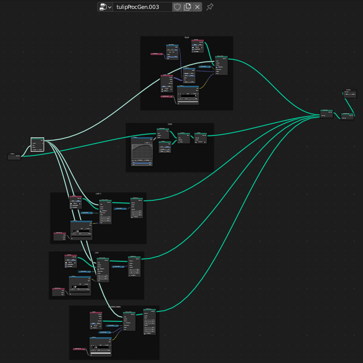
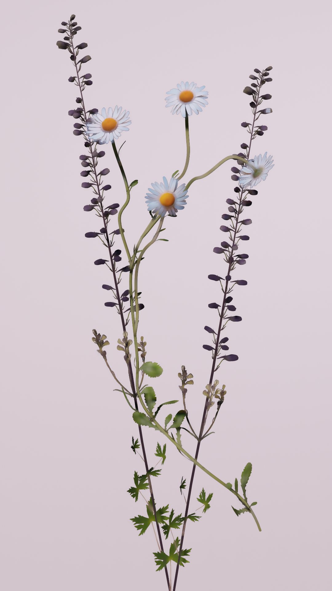
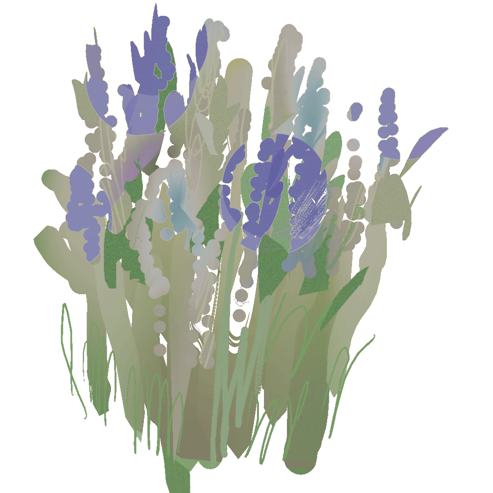
i created a modular system to produce foliage using freehand splines, hand-drawn by the user, which automatically generates plants & flowers driven by geometry nodes.
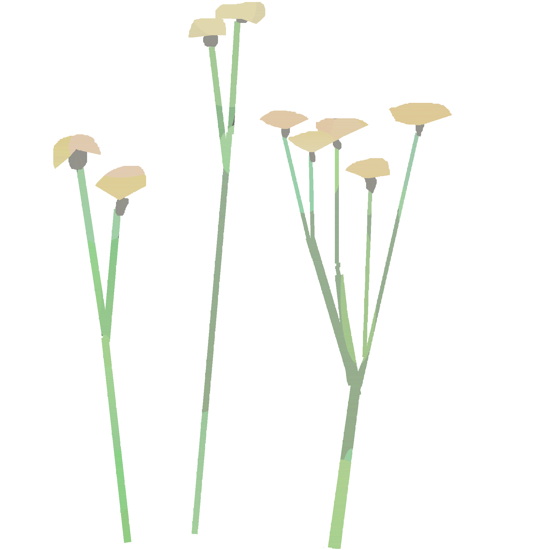
When generating tulips, we instantiate the flower head at the tip of the spline. We also instantiate the leaves in three different ways in the lower section of the spline. These sections use collections of 4-6 assets to increase variation, and these assets were created directly from photo reference.
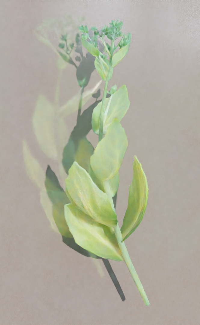
When modelling the leaves and stems, cloth simulations were used to ‘drape’ the leaves over shapes, which gives the impression of realistic physical behaviour as the leaves appear to droop or fold under their own weight.
this system can be used to create practically any plant.
It seemed important to make foliage feel like it was living, and had lived. Like any organism, plants are shaped by their experiences. If it grew perfectly, it would not be real.
In Pursuit of
Digital Impressionism
In Pursuit of
Digital Impressionism
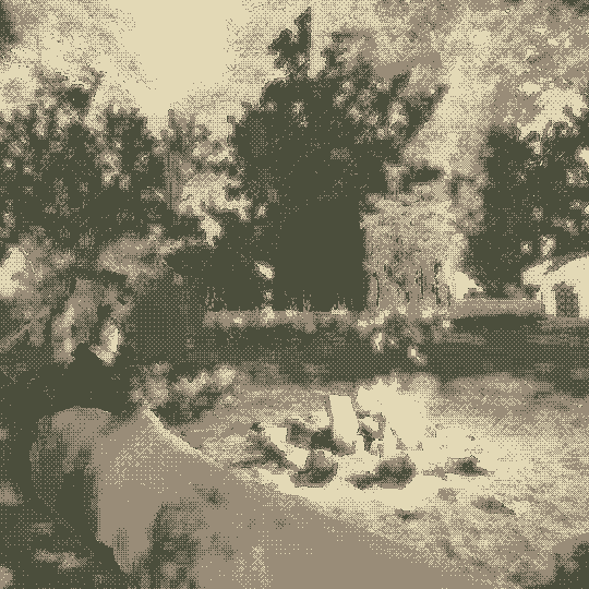
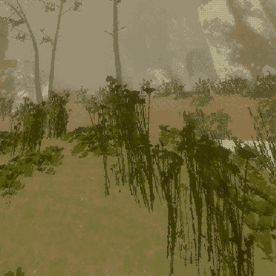
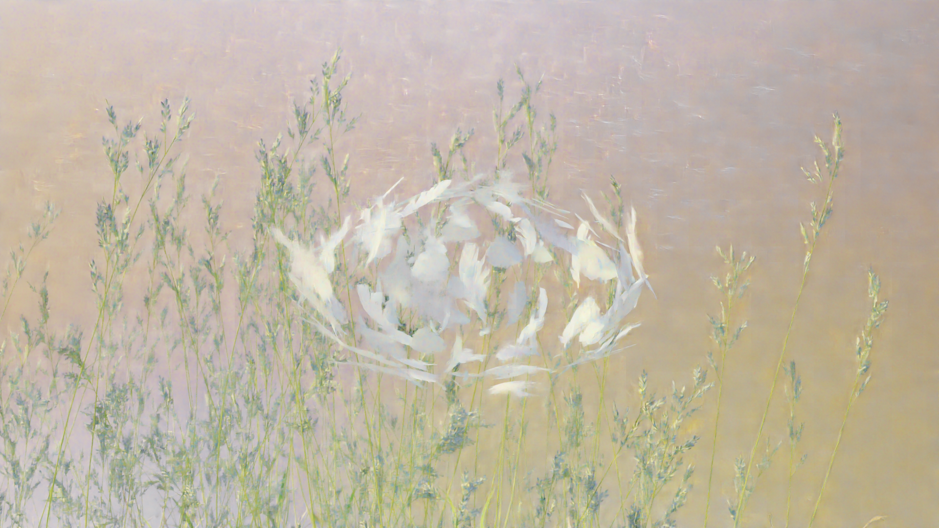
I observed that 3D modelled plants, no matter how photorealistic, often risked appearing artificial. I studied the still lifes of dutch masters and identified certain techniques they used that highlighted the life of their subjects. I then looked at how subjects were depicted in the the early impressionist era, particularly works created en plein air.
It was my intention to establish a rendering style that was similarly both descriptive and evocative.
I used a combination of methods to create this effect. rendering with low-sampling introduces grain, creates artifacts, homogenizes and ‘smudges’ areas of high detail, which I was initially using as a performant strategy. I combined this with optiX AI-denoising, which smooths out the artifacts and interweaves colour values, creating a dappled visual style and a painterly effect. This was accentuated through a combination of depth-of-field and fog volumes with light scattering.
There were some limitations to this method. It was most effective when using HDRIs alongside reflective materials with many light sources, which created more opportunities to dapple light and colour on the objects.
This effect was achieved in blender, but the fundamental idea could be translated to other contexts. It was used in the work ‘Antifragile’, exhibited in the Glyndebourne Open Art Tour (2021), alongside traditional paintings and other digital artworks.
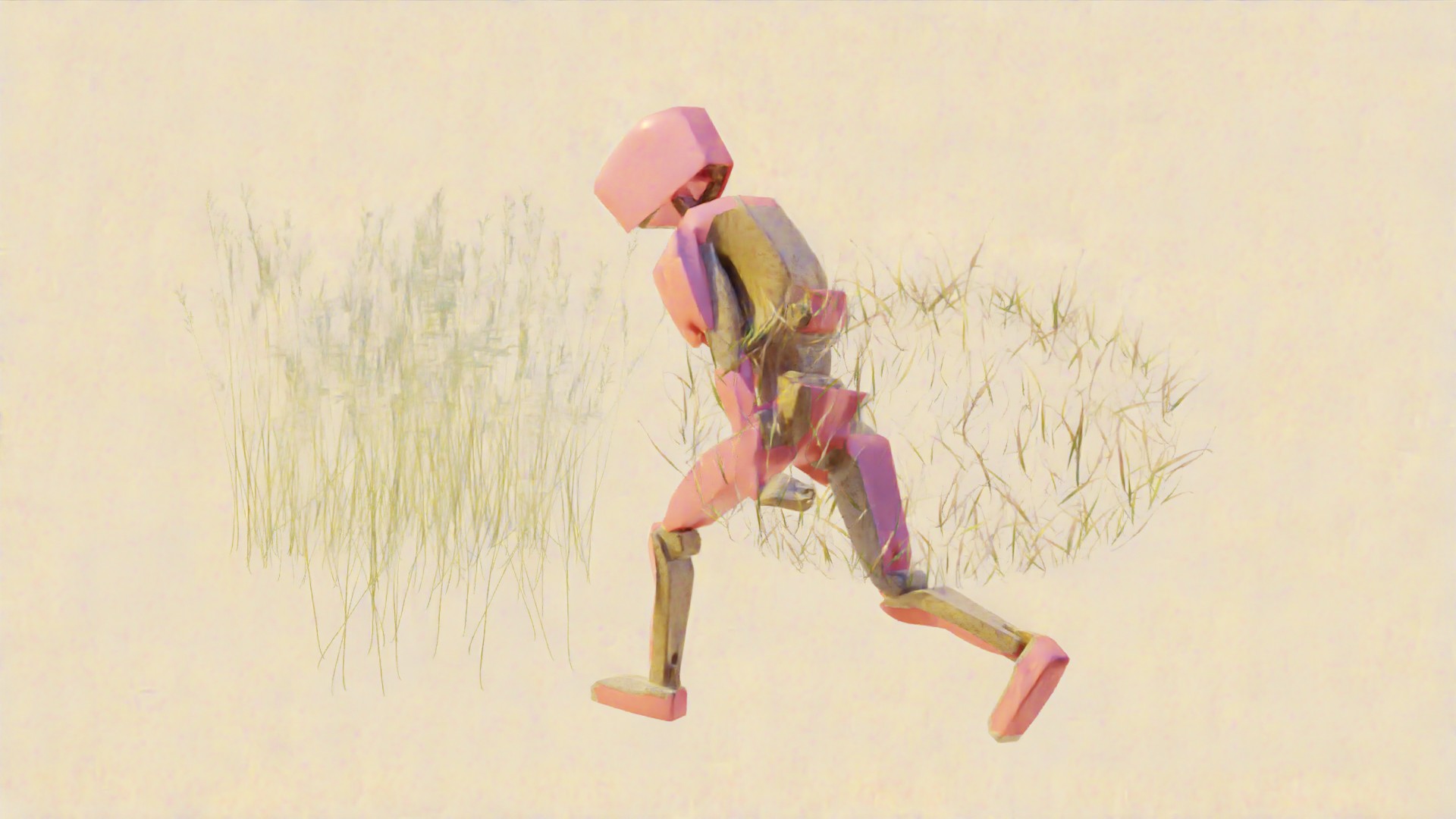
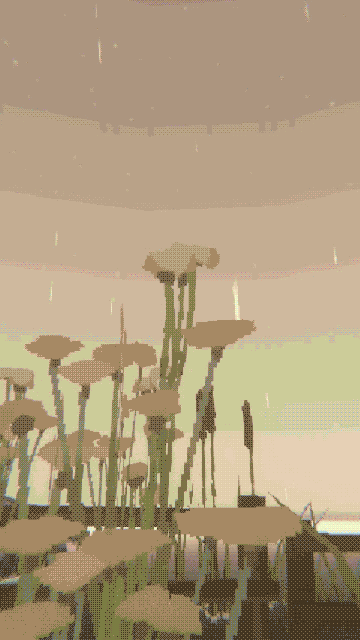
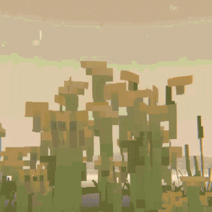
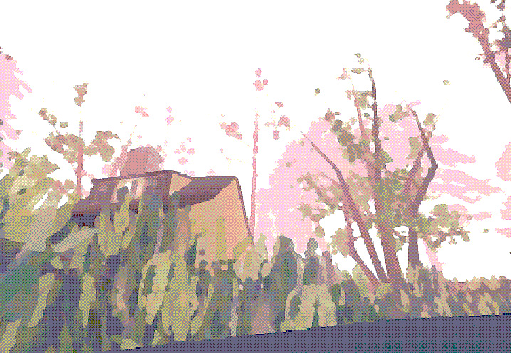
Within Unity I pursued a different version of this digital-impressionist style that didn’t depend on ray-tracing and volumetric fog. I sought to use low-resolution techniques & downsampling to experiment with a different kind of digital impressionism.
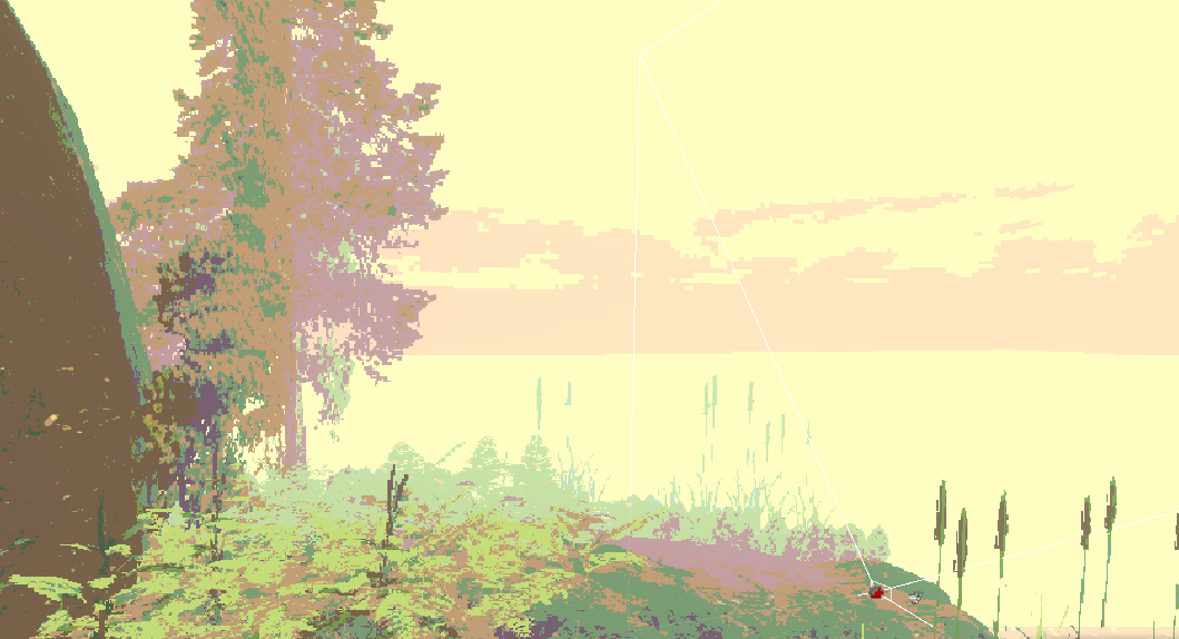
This effect was achieved via simplified topology with stylized, hand-painted textures focused on the geometrical characteristics of natural forms. this highlights the unique charm of videogame graphics, while still feeling natural and wild.
screen space ambient occlusion distinguishes objects from eachother and gives depth within the scene, as no lights or reflections were used. You can see how within this style, textures can be compressed from 2048px to 64px, without negatively affecting the visual appearance and breaking immersion.
This methodology allows artists to reduce the detail of scenes for stylistic purposes.
Within this style, low-fidelity textures become suggestive and charming, and players experience a nostalgic or dream-like atmosphere.
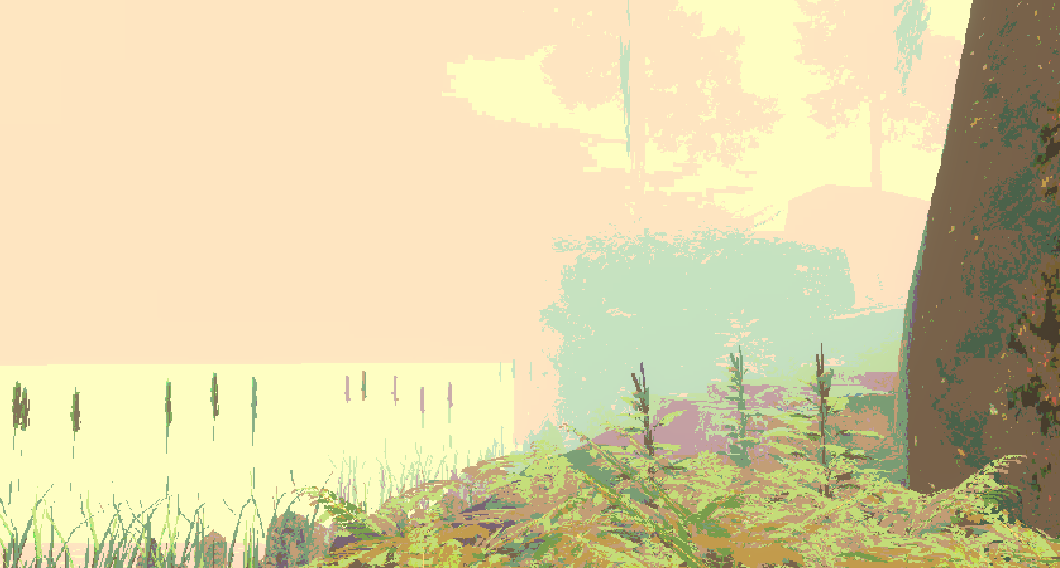
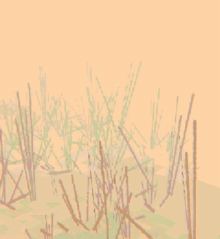
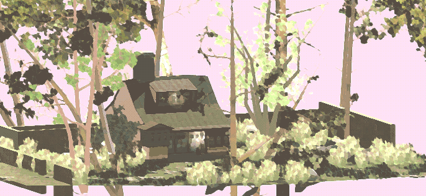
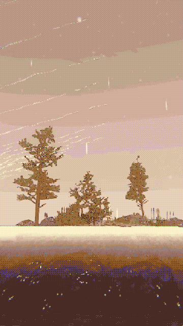
up close, the textures themselves are constructed purely from abstract linework and geometric shapes, along with soft gradients. I was aiming to only use processes that were innately digital, so I would limit myself to using a perfectly circular, hard-round brush or filling with lasso selection. I found that using a mouse rather than a stylus would accentuate the art style at times as it had unique restrictions. establishing a muted colour palette allows all of these shapes to blend together, and the abstract nature of these textures is only revealed when a player gets close enough to an object to inspect them. The goal was for the player to want to look at the finer details, only to find gentle chaos and disarray, coming together to create something surprisingly harmonious- much like nature itself.
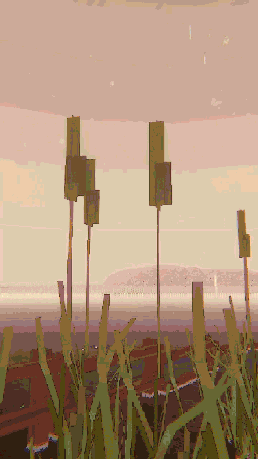
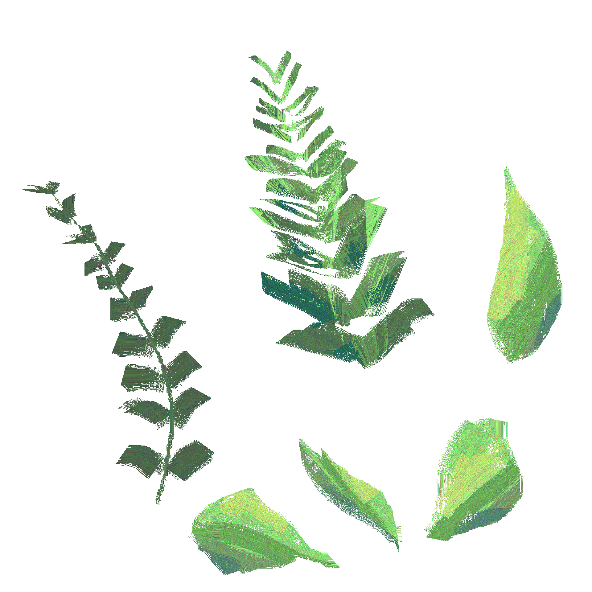
the silhouettes and forms became extremely important as they are the most descriptive aspect of the objects, and these forms are observed, overlapping, from a range of angles and distances. It helped to select plants that had architectural qualities.
the silhouettes and forms became extremely important as they are the most descriptive aspect of the objects, and these forms are observed, overlapping, from a range of angles and distances. It helped to select plants that had architectural qualities.